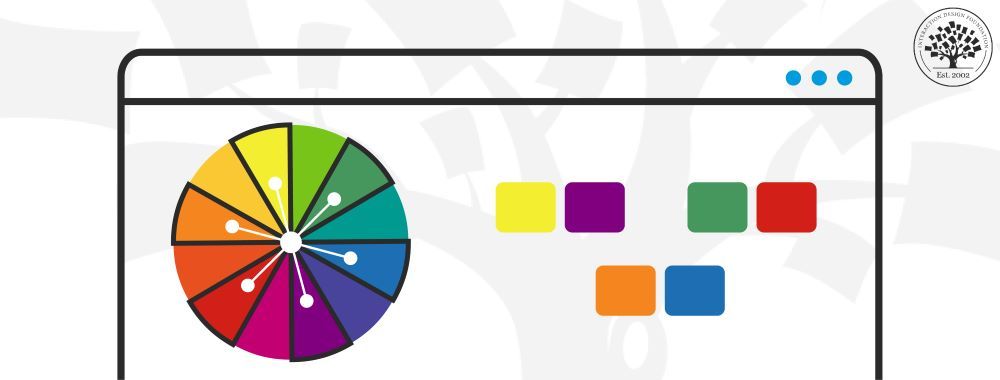
When it comes to user interface (UI) design, color plays an important role. It enhances aesthetics, shapes the user experience, and influences decision-making. Color creates an impactful dialogue between the design and its audience, whether you want to spark interest, convey a message, or stir emotions.
It’s crucial to stay updated with the latest shifts in design as trends continuously evolve.
So, let’s understand all about the UI Color Palette. We’ll explore the best practices, essential tips, and innovative tricks that will help you navigate the landscape of UI design.
Understanding UI Color Palettes
A UI color palette is a collection of colors used in designing a user interface. Think of it as the designer's paint box. It holds a specific set of colors for use across an application or website. The colors in this palette work together to form a cohesive visual experience.
A UI color palette is essential for establishing visual harmony, defining brand identity, and influencing user behavior. A well-curated color palette enhances the user experience as it guides users seamlessly through the interface.
Difference between a Color System and a Color Palette
A color palette and a color system work hand-in-hand. The palette provides specific colors, while the system offers a structured way to organize the colors.
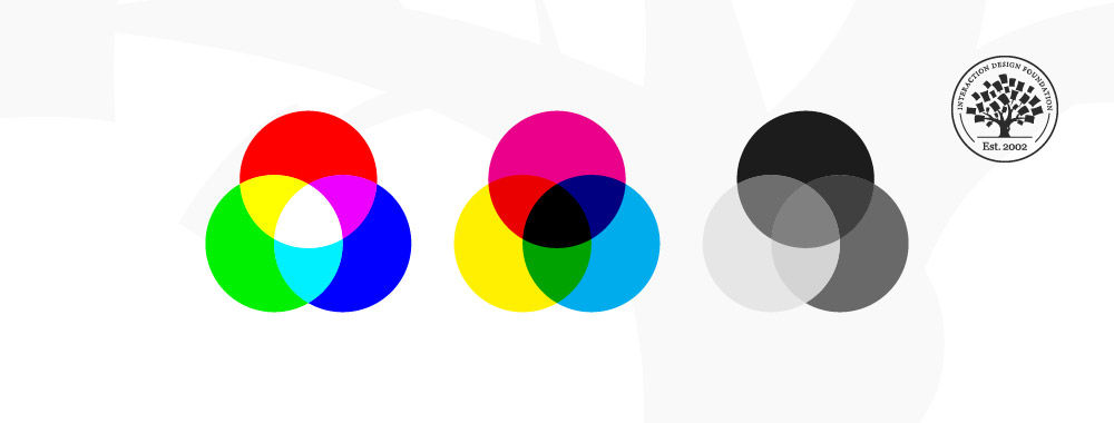
Here’s what a color system means - A color system is a collection of colors chosen from a particular visual range. It's like a color toolbox where you can mix a few selected colors to create shades and hues. You can create a color theme based on your chosen material design color system. RGB, CMYK, and Lab are all examples of such color systems. When it comes to applying color to an interface, RGB is what we use. In screen design, we use the color model, with red, green, and blue as primary colors.
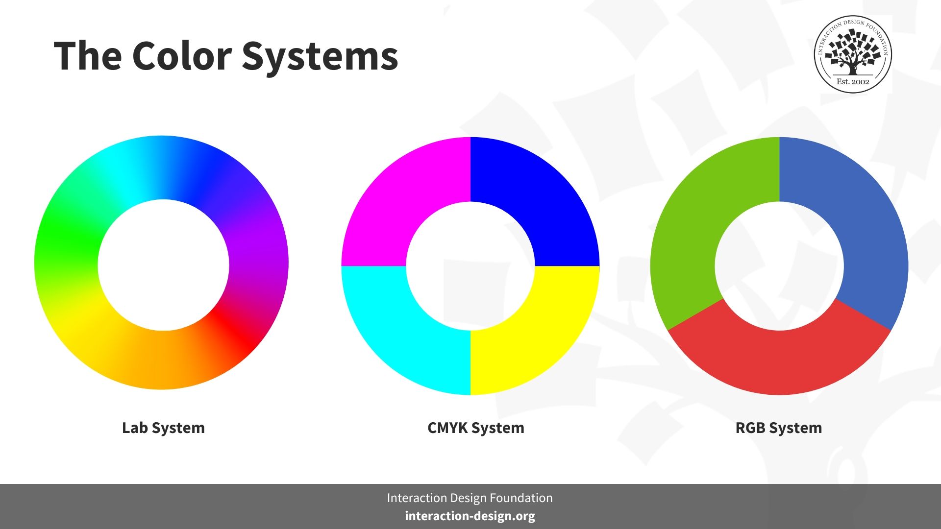
© Interaction Design Foundation, CC BY-SA 4.0
Learn how to use color to prevent confusion and help your users.
Basics of Color Theory in UI Design
Color theory is a framework that underpins how we understand and use color. Conceived by Sir Isaac Newton in 1666 with the invention of the color wheel, color theory has expanded beyond identifying primary, secondary, and tertiary UI design colors.
It now encompasses various fields.
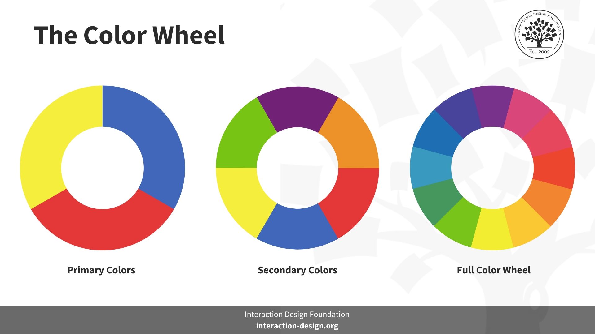
© Interaction Design Foundation, CC BY-SA 4.0
Michel-Eugène Chevreul, a French chemist, then came up with Principles of Color Harmony (1839), which help us understand and use colors today. Chevreul devised a simple yet effective rule to explain the visual effect of simultaneous contrast in all kinds of situations: when two colors are seen side by side or one after another, each color seems to change in hue and brightness as though it had been mixed with the opposite color from the color wheel. Chevreul’s theory was very influential in the French Impressionist movement.
Now, let's break down the critical components of color, i.e., HSL (hue, saturation, and lightness).
Hue is the color you pick from a wheel.
0 or 360 is red.
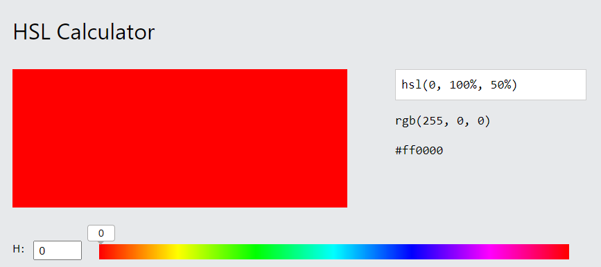
© W3schools, Fair Use
120 is green.
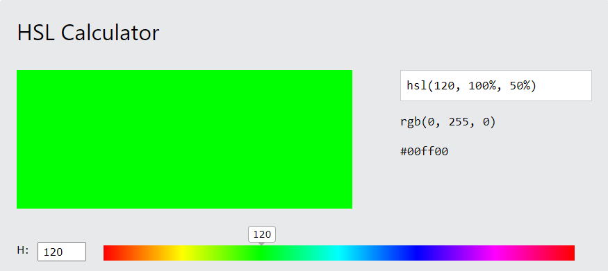
© W3schools, Fair Use
240 is blue.
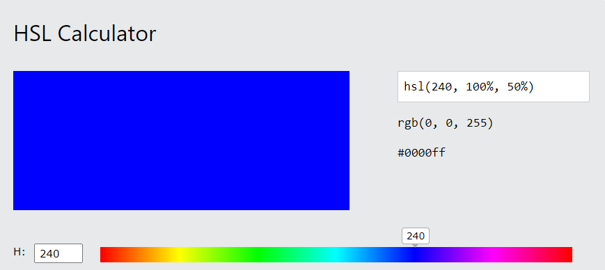
© W3schools, Fair Use
Saturation is how strong the color is.
100% means the color is bright and pure.
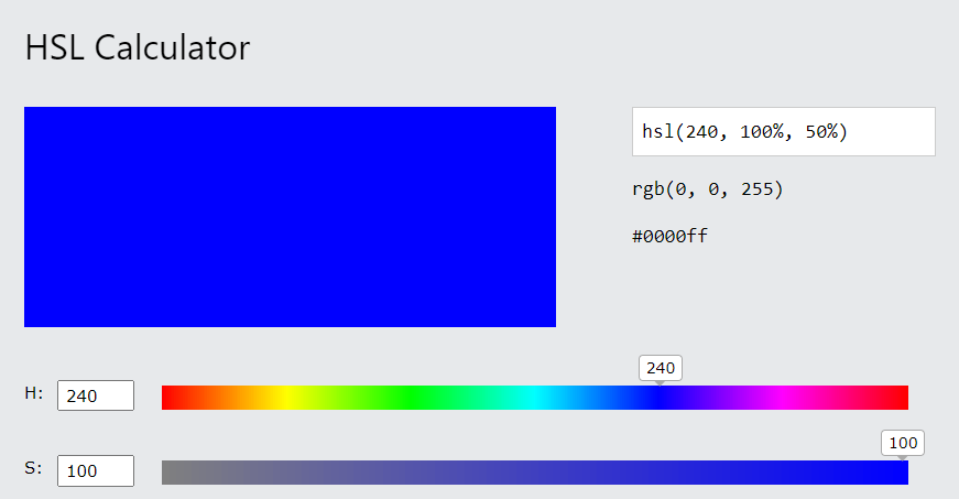
© W3schools, Fair Use
50% means the color is mixed with gray.
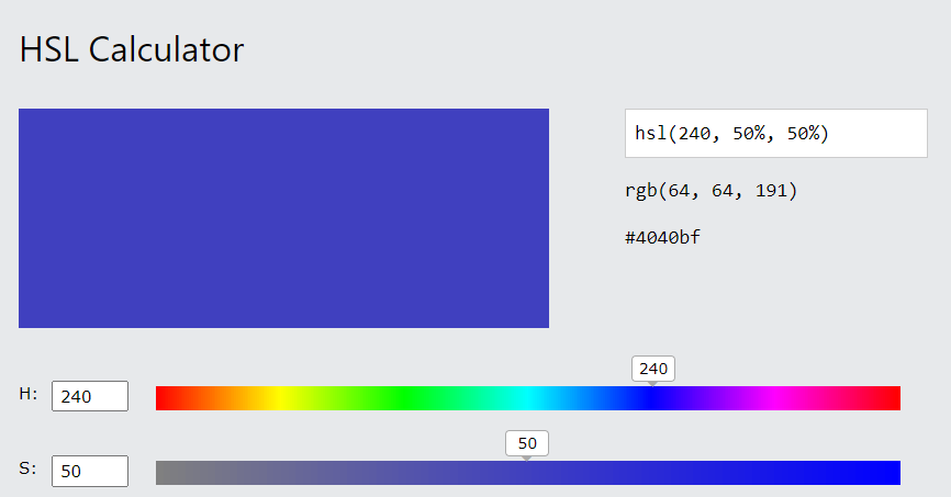
© W3schools, Fair Use
0% means you see only gray, no color.
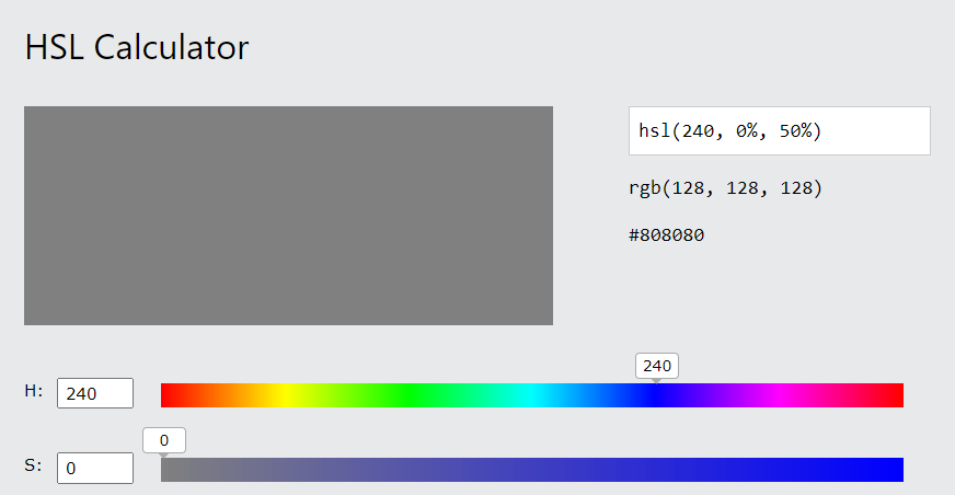
© W3schools, Fair Use
Lightness is how much light the color has.
0% is very dark.
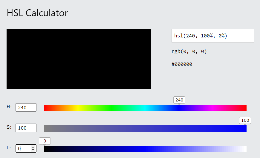
© W3schools, Fair Use
50% is in the middle, not too dark or light.
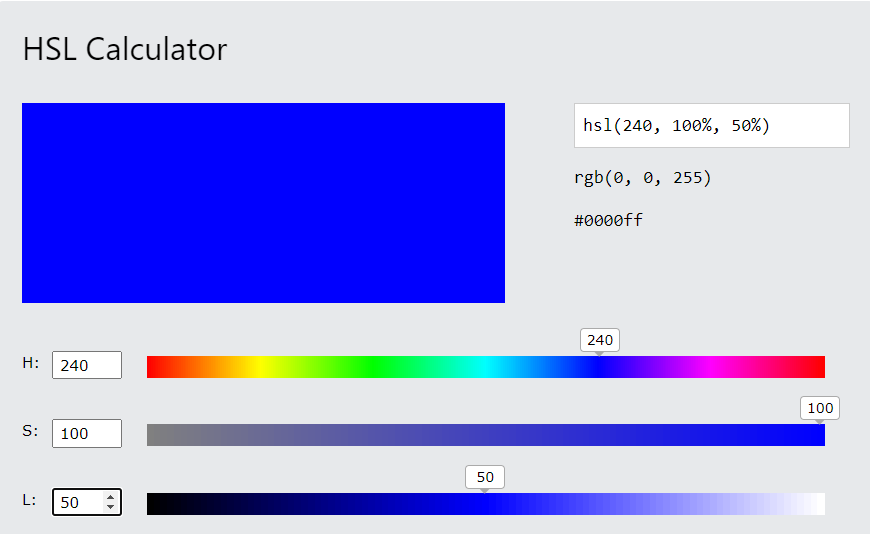
© W3schools, Fair Use
100% is very light or bright.
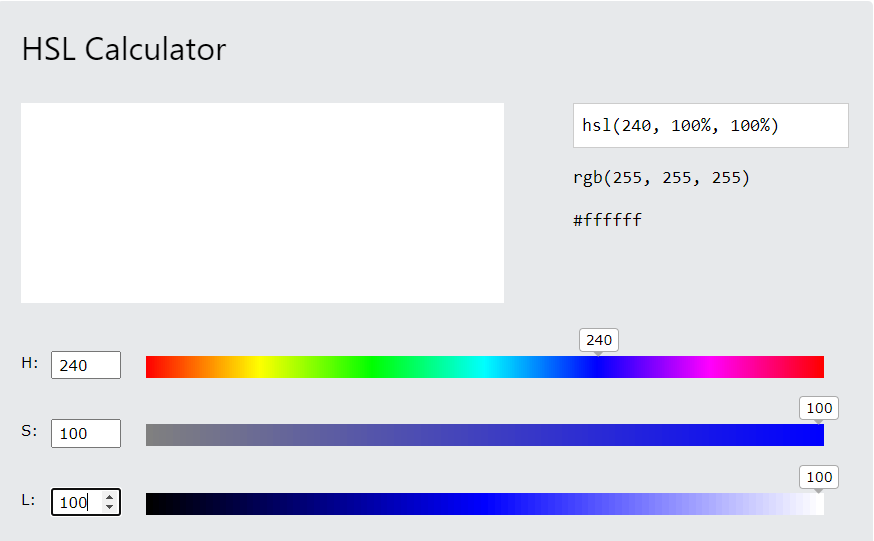
© W3schools, Fair Use
Understanding and applying these elements are crucial in UI design. It empowers designers to create harmonious, meaningful web and mobile app designs that enhance the user experience.
So, how does color theory in UI design play out in practice?
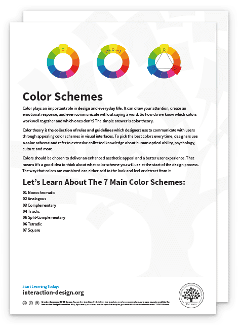
One approach to practically applying color theory lies in creating color schemes vital for design harmony. A color scheme is a set of colors that work well together visually.
You can utilize several main color schemes:
Monochromatic: The monochromatic scheme involves taking one hue and creating other design elements from shades and tints.
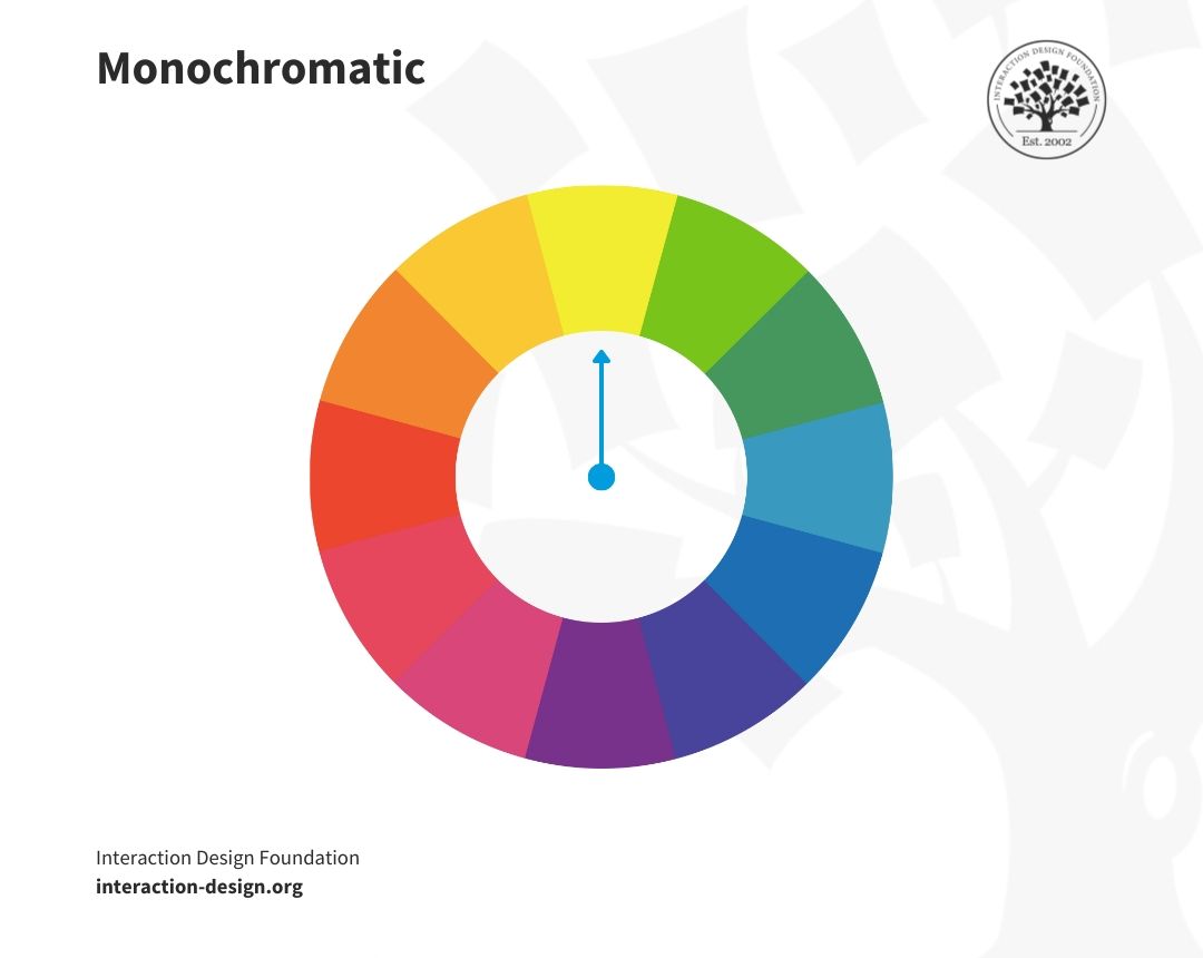
© Interaction Design Foundation, CC BY-SA 4.0
Analogous: Analogous colors involve using three colors next to each other on the color wheel, such as blue, blue-violet, and violet.
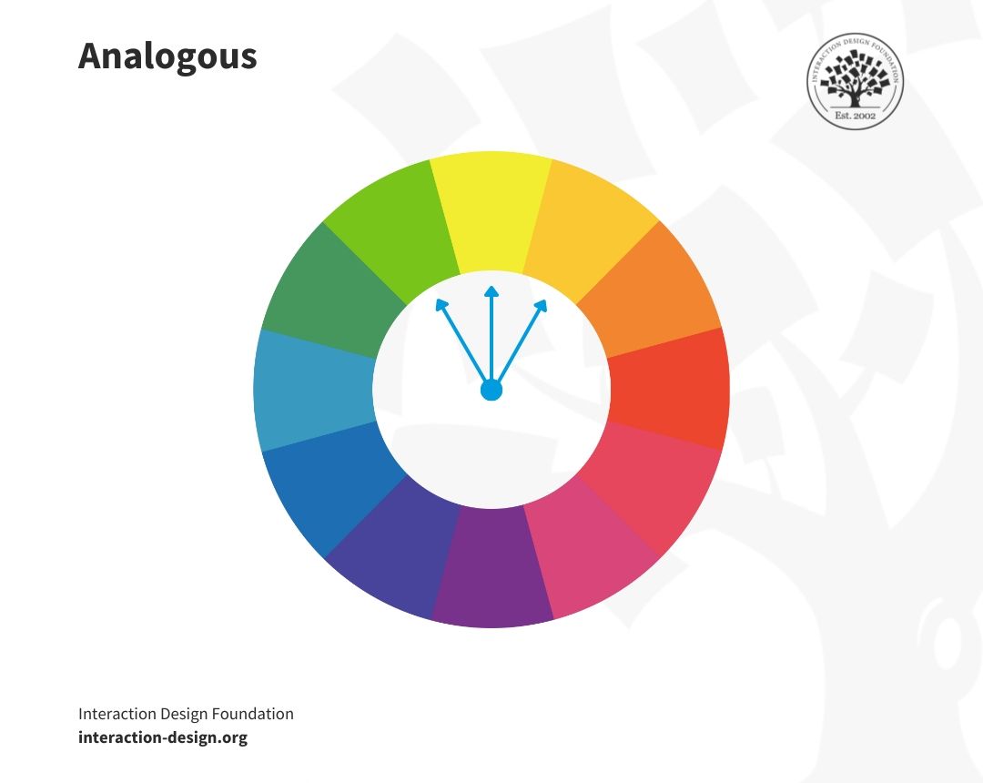
© Interaction Design Foundation, CC BY-SA 4.0
Complementary: Designers use 'opposite color' pairs like blue and yellow to maximize contrast here.
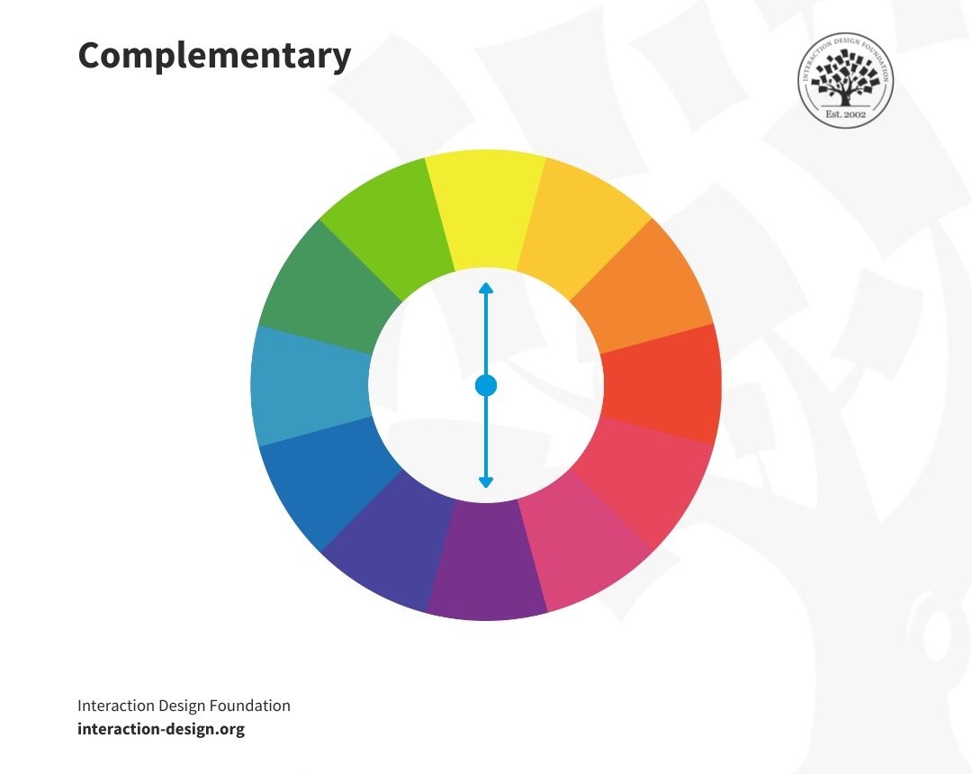
© Interaction Design Foundation, CC BY-SA 4.0
Split-Complementary: This scheme uses colors from either side of your complementary color pair to soften the contrast.
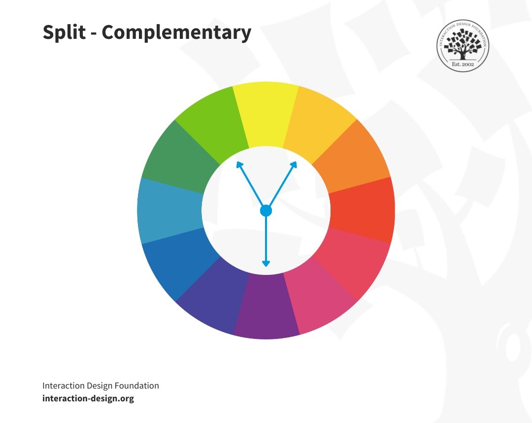
© Interaction Design Foundation, CC BY-SA 4.0
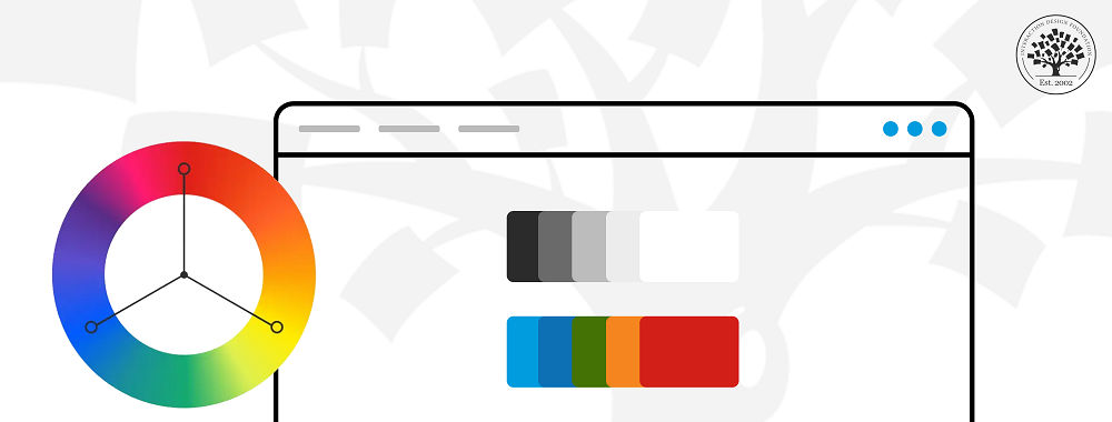
Triadic: The Triadic scheme uses three equally distant colors on the color wheel. It maintains harmony and high contrast.

© Interaction Design Foundation, CC BY-SA 4.0
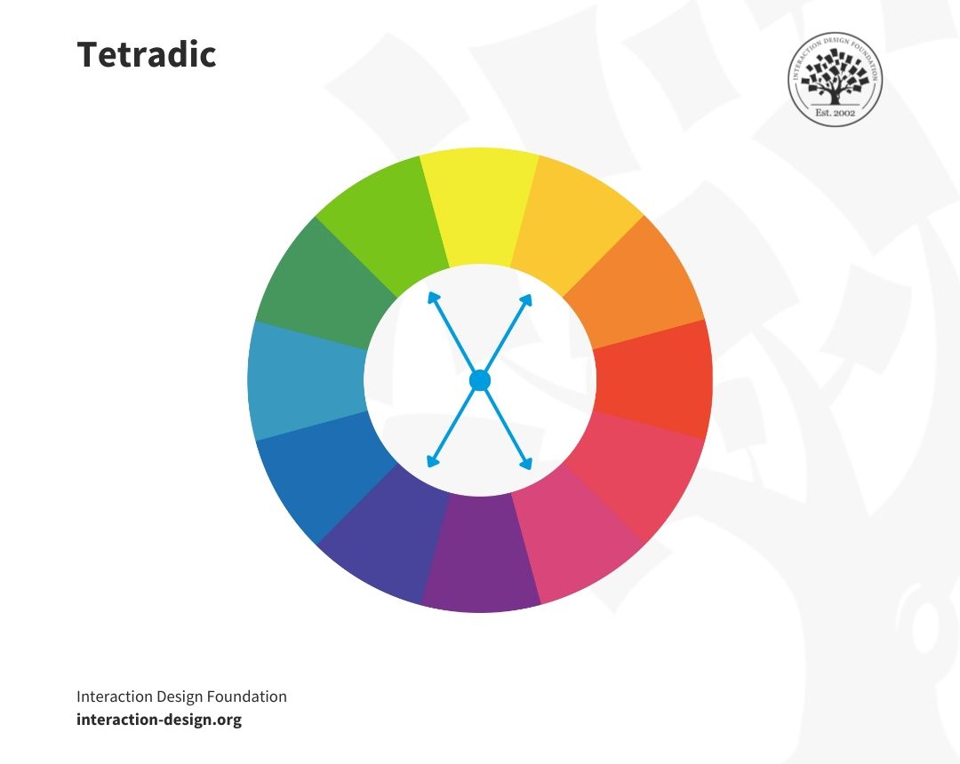
Tetradic: This involves using four colors that form two sets of complementary pairs with one color dominating.
© Interaction Design Foundation, CC BY-SA 4.0
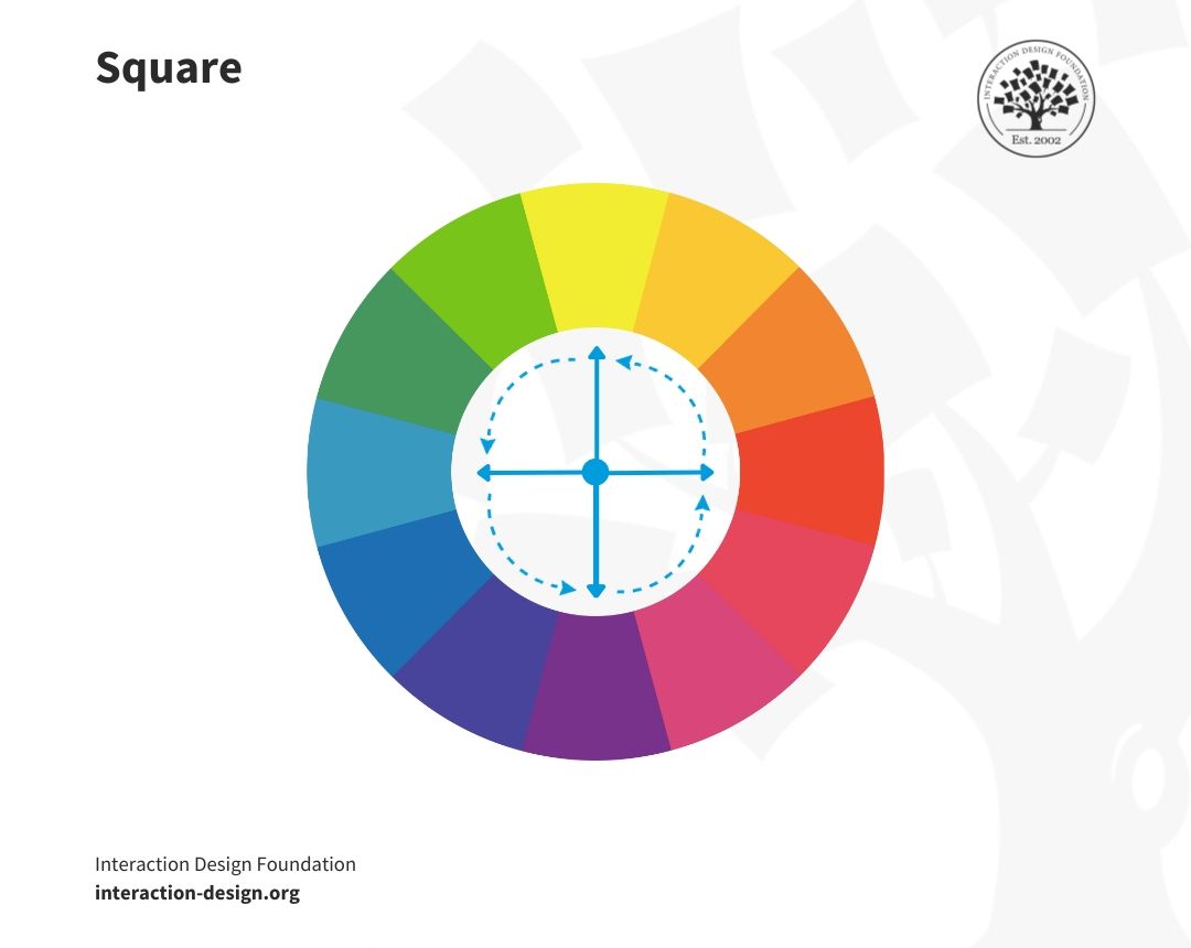
Square: A variant of tetradic, this scheme finds four colors evenly spaced on the color wheel.
© Interaction Design Foundation, CC BY-SA 4.0
Learn about color theory keywords and their significance.
The color schemes must align with the design's goal and the brand's personality. Furthermore, understanding color temperature (whether you use cool, warm, or neutral colors) can help designers align the color scheme with the message they want to convey.
But why is color theory vital for UI design?
Color is a powerful communication tool in the digital space. Color theory in UI design guides designers to create visually engaging interfaces that users find intuitive and easy to navigate. It helps distinguish elements on a page, contributes to visual hierarchy, draws attention to key elements, and creates an aesthetically pleasing user experience.
The correct application of color theory can lead to increased user engagement, improved usability, and a positive user experience. Moreover, colors can help reinforce brand identity and messaging across digital platforms.

The Psychology of Color in UI Design
Imagine walking into a serene dark blue room, then into a vibrant red one. The shift in your mood and perception is noticeable, isn't it? Now, transfer this concept into the digital world. That's the power and psychology of color in UI design.
However, the interpretation of colors can vary significantly across cultures. It shows a diverse spectrum of associations and feelings. Here are the meanings and interpretations of various colors based on research:
Red: Represents happiness in China and danger in the United States.
Blue: Perceived as peaceful or calming across cultures, while it has authoritative and conservative meanings in some parts of the West.
White: Symbolizes purity and innocence in some parts of the West and death or the supernatural in some parts of the East.
Green: Represents growth, new life, and nature in numerous cultures, while it’s sometimes connected to sickness or greed in others.
Colors are not just visual elements. They possess the ability to communicate, influence decisions, and steer emotions due to color symbolism. This psychology of colors plays a pivotal role in shaping user behavior and perception.
Learn more about color symbolism and why it matters significantly in design.
Examples of Color Symbolism
Social media platform Facebook's signature blue color isn't a random choice. Mark Zuckerberg, co-founder of Meta, has red-green color blindness; blue is the color he sees best. But beyond personal preference, blue in Western color psychology signifies trust, dependability, and security. It is the perfect palette for a platform that handles personal data and seeks to nurture a global community.
The bold red of the popular streaming platform Netflix creates a sense of excitement and urgency, perfectly capturing the spirit of entertainment. In contrast, the black background provides depth and focus. It directs attention to the content thumbnails. It's no accident that users find browsing and selecting shows on Netflix to be a thrilling experience.
The above examples illustrate the psychological impact of color in UI design in Western culture. They show how smart color choices can align with a brand's identity and influence user perceptions, driving specific user behaviors. Naturally, the choice of colors must be relevant to the cultures of the target audience.
The psychology of color in UI design is a fascinating field, with its principles rooted in human behavior and cultural contexts. It's a critical aspect designers must consider while choosing their color palette. Designers can use these principles to create more effective, engaging, and user-centered designs.
How to Create a UI Color Palette: Trends and Best Practices for 2023
Creating a UI color palette involves a mix of creativity, awareness of current design trends, and a deep understanding of the impact of color on user behavior. It's a process that can shape the entire user experience and determine how engaging, user-friendly, and visually cohesive your design is.
With the evolving trend of bold colors and gradients, staying updated and incorporating these elements wisely into your design is crucial. Here are some steps to create the best UI color palettes in 2023:
1. Choose Primary, Secondary, and Accent/Supplementary Colors Wisely
Choosing the right primary and secondary colors and accent colors is essential in creating an effective UI color palette.
In the context of a UI color palette, the primary color appears most frequently across your screens to guide users toward the key points of the UI. This is the color most strongly associated with your brand—for example, the blue of Facebook. Similarly, secondary and accent colors are vital in highlighting and distinguishing different parts of your interface.
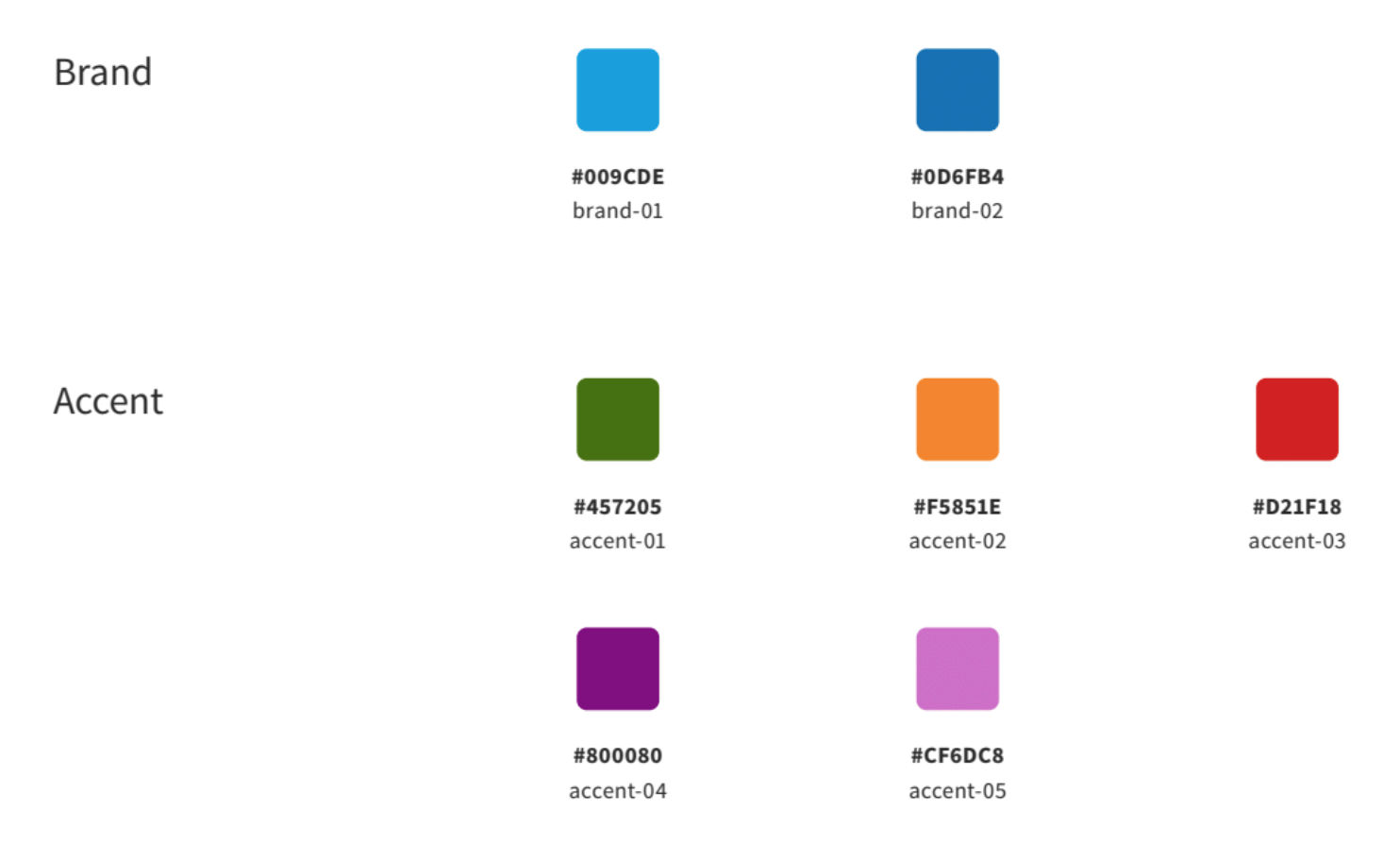
The IxDF’s color palette consists of 2 versions of blue as the primary color and 5 accent colors (shades of dark green, orange, red, purple and magenta) used in different contexts.
© Interaction Design Foundation, CC BY-SA 4.0
Color contrast plays a key role when you choose a primary color, as a lack of sufficient contrast can lead to accessibility issues.
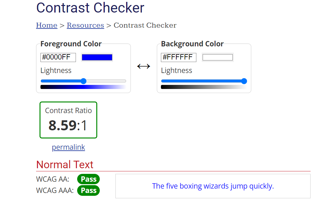
The Web Content Accessibility Guidelines (WCAG) provide standards to ensure that the color contrast ratio between the foreground and background is high enough to be easily readable by most users. It recommends a contrast ratio of at least 4.5:1 for normal text and 3:1 for large text. There’s no requirement (yet) to meet WCAG AAA criteria for color contrast.
© WebAIM, Fair Use
Here's how to choose and use these colors wisely:
Primary colors: Start by selecting your primary color, which should ideally be one of the main colors associated with your brand. Your primary color will be the most prominent color across the screen, guiding users to the main elements of the UI. Keep your primary colors to a maximum of 1 to 3 choices for consistency and recognition.
Avoid absolute white or black: When you deal with backgrounds or large areas, avoid using total white or black. These colors can strain the eyes due to their extreme contrast. Instead, opt for a grayscale palette from neutral black and white tints. It creates a more comfortable viewing experience.
Maintain consistency: Use the same colors for similar interactive elements in your color scheme. For instance, all links and buttons should share the same color. It helps users identify interactive components seamlessly.
Use semantic colors: Semantic colors convey meaning to the users. You can leverage semantic colors to highlight important information or changes in UI status. These. For example, red is used for caution/danger, while green is used for positive connotation. They are excellent tools for drawing attention to critical elements or providing quick visual feedback. It's important to consider the cultural contexts of colors before going ahead with any semantic colors.
2. Follow the 60-30-10 Rule
Designer and Co-founder of HYPE4.com, Michal Malewicz, describes the 60-30-10 rule in this video.
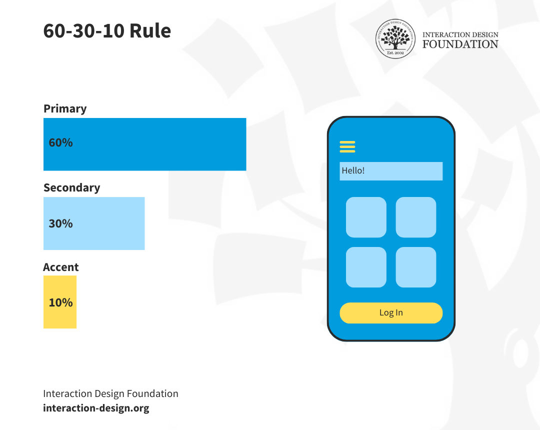
The 60-30-10 rule is a time-tested guideline that ensures balance and visual comfort in your design. According to this rule,
60% of your space should be covered with the primary color;
30% with the secondary or supportive color;
10% with an accent or guiding color.
"Covered" refers to the visual real estate each color occupies. Imagine your design canvas as 100%—it could be a web page, a room, or a poster. The 60-30-10 rule suggests how much of that canvas each color should fill.
For instance, in web design, your primary color might fill 60% of the space. You can use it in the background and on large elements like headers. The secondary color, taking up 30%, might be for subheadings, captions, or smaller divs. Then, you can fill the remaining 10% for calls-to-action or highlights using your accent color.
© Interaction Design Foundation, CC BY-SA 4.0
This proportion helps guide the user's eye smoothly across the interface. It prevents your design from appearing chaotic or overwhelming.
Here are the steps to apply the 60-30-10 rule:
Identify the Canvas: Determine the total area you're working on.
Select Colors: Choose your primary, secondary, and accent colors.
Mapping: Plan out where each color will go.
Apply: Begin filling in the design with the planned colors.
Review: Step back and adjust as needed to meet the 60-30-10 balance.
Explore various color combinations, employ shades and tints, utilize online color tools, and test your design across devices and lighting for an effective 60-30-10 application.
3. Understand Your Audience
Understanding your audience is essential to creating a successful UI color palette. Your chosen colors significantly impact the user's emotions and feelings toward your product. Consider your target audience's demographics, your product's purpose, and the emotions you want to evoke when making color choices. You can conduct user research to learn more about your audience.
Learn more about when to do user research and how it helps your design process.
Video copyright info
Images
4. Use Photos to Create Your Palette
Nature and architecture can serve as excellent inspirational sources for a unique website color scheme. Some online tools and plugins can help you generate a color palette from an image, making the process simple and fun.
5. Use Contrast Effectively
Contrast is a great way to direct the user's attention to specific elements. High contrasting colors can quickly communicate context and guide users to focal points. However, too much contrast can make a UI difficult to scan. So, striking a balance and testing your design on different screens is essential.
6. Use a Straightforward Naming Convention
Naming your colors effectively within a design system is an often overlooked but vital step. Rather than using vague names, you can opt for descriptors that improve consistency and clarity. You can leverage standardized color systems like W3C web standard colors or color systems like Pantone as a better solution to color naming.
The process of creating a web and mobile UI color palette is an art that requires an adequate understanding of color theory, current design trends, and user psychology. By following these steps, you can create a palette that resonates with your audience and enhances their experience with your product.
Best Practices for Accessibility in UI Color Palettes
Creating an attractive UI color scheme for your design is one part of the puzzle; ensuring its accessibility for all users is another significant part. Accessibility in UI color palettes ensures that your digital platforms are usable and enjoyable for everyone, including people with visual impairments or any type of color blindness.
Now, why is this crucial?
Around 16% of the world's population lives with some form of disability, with vision impairment being the most common. Thus, your design isn't successful if it doesn't cater to this substantial user segment.
Moreover, it’s important to consider screen and lighting variations, as low-contrast color palettes can pose challenges under varying conditions. Bright sunlight, for example, can play havoc with low-contrast color schemes. Hence, accessibility and adaptability to different viewing conditions make for a truly successful design.
So, how do you create accessible color palettes? Here are some best practices to guide you.
Sufficient Color Contrast: The contrast ratio between the text color and its background must be high enough for everyone to read comfortably. Tools like WebAIM's Contrast Checker can help check the contrast ratio of your colors.
Avoid Color-Dependent Information: If your design uses color to convey information, ensure there's an alternate way for people who can't distinguish these colors. For instance, use patterns, textures, or icons alongside colors.
Grayscale Test: Check your design in grayscale mode. If it still makes sense and looks good, it's likely to be accessible to those with color vision deficiencies.
Use of Labels and Indicators: Don't rely on color alone to indicate interactivity or state changes in UI elements. Use text labels, changes in size, or other visual indicators to help.
Tools for Checking Accessibility: Several tools like Color Safe and Contrast Grid can help you design color palettes that comply with accessibility standards.
Mindful Use of Colors that May Trigger Seizures: Avoid using colors that may trigger photosensitive reactions, such as certain shades of red or rapidly flashing lights.
Creating accessible color palettes demands mindfulness. The goal is to ensure your digital product's information is perceivable, operable, and understandable to all, regardless of their visual abilities. Making your designs accessible will increase your reach and user satisfaction and contribute to a more inclusive digital world.
Examples of Good UI Color Palettes
Observing and learning from success stories is a great way to gain insights and inspiration. So, let's look into some examples of good website design color palettes from various industries and understand why they work.
1. Spotify: Music Streaming

© Spotify, Fair Use
Spotify’s UI design is a masterpiece of minimalism, marked by its iconic green-and-black color scheme. The bold, vibrant green conveys energy and freshness, apt for a platform that serves fresh tunes to music lovers. The contrasting black backdrop offers depth and makes the green elements stand out. This high-contrast palette allows easy navigation, boosting the user experience.
Lesson: Contrasting colors enhance visibility and guide user attention.
2. Airbnb: Travel and Hospitality
© Airbnb, Fair Use
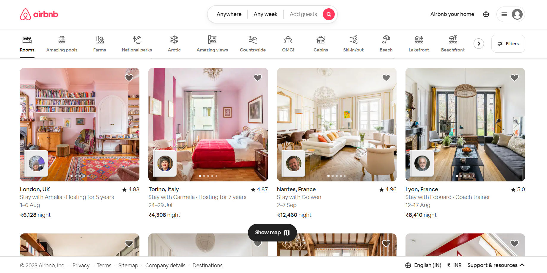
Airbnb's gray, red, and white UI color palette effectively communicates its brand ethos. The warm, welcoming red denotes love, comfort, and passion, reflecting Airbnb's mission of creating a home away from home for travelers. The clean white background offers space, calm, and simplicity. The balance between these colors makes for a pleasing and user-friendly interface.
Lesson: Colors that align with brand values enhance brand identity and connect with users emotionally.
3. Asana: Project Management

© Asana, Fair Use
Asana uses a multi-color palette to represent different tasks and priorities in their project management tool. The colors are bright yet soft on the eyes, which is crucial for a platform where users spend significant time. The variety in color also allows for better organization, categorization, and visual distinction of tasks, which enhances usability.
Lesson: A well-chosen multi-color palette can aid usability, especially in complex systems.
4. Instagram: Social Media
© Instagram, Fair Use
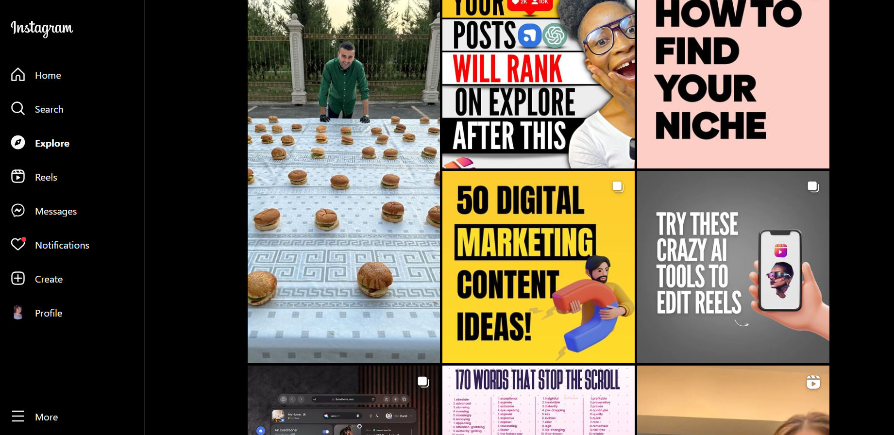
Instagram, the photo and video-sharing app, uses a gradient color scheme in its logo and a simple, monochromatic UI within the app. The colorful logo signifies creativity, diversity, and life, which attracts the user. The simple black-and-white theme inside the app ensures that the user focuses on the content, the photos, and not the UI elements.
Lesson: A minimalist palette helps keep the user's focus on the main content.
5. Slack: Team Collaboration

© Slack, Fair Use
Slack, the popular collaboration tool, utilizes a unique purple-centric palette. Purple, often associated with creativity and wisdom, is an unusual choice for a corporate tool. It sets Slack apart from its competitors. The platform leverages vibrant secondary colors for categorizing channels and activities, which enhances user navigation.
Lesson: A unique color choice can differentiate your product in a competitive market.
These good UI color palettes illustrate how the right and most beautiful colors can enhance usability, reflect brand identity, guide user attention, and even provide a competitive edge.
Tools for Building UI Color Palettes
Designers are no longer left to their own devices when creating stellar color schemes. Several online tools can help build practical, attractive, and accessible UI color palettes. These resources simplify the process, inspire, and help ensure your designs meet accessibility standards. Let's look at the top tools that designers can harness.
1. Adobe Color
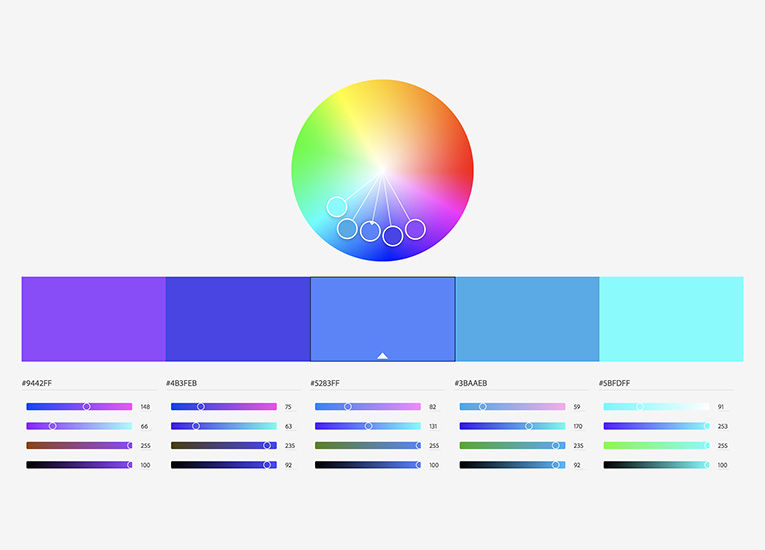
© Adobe Color, Fair Use
Adobe Color is an industry favorite. It allows designers to create color schemes based on color theory rules. The tool also features the option to upload an image and generate a color palette based on it. A noteworthy feature is the ability to check color accessibility, an essential consideration in UI design.
2. Coolors
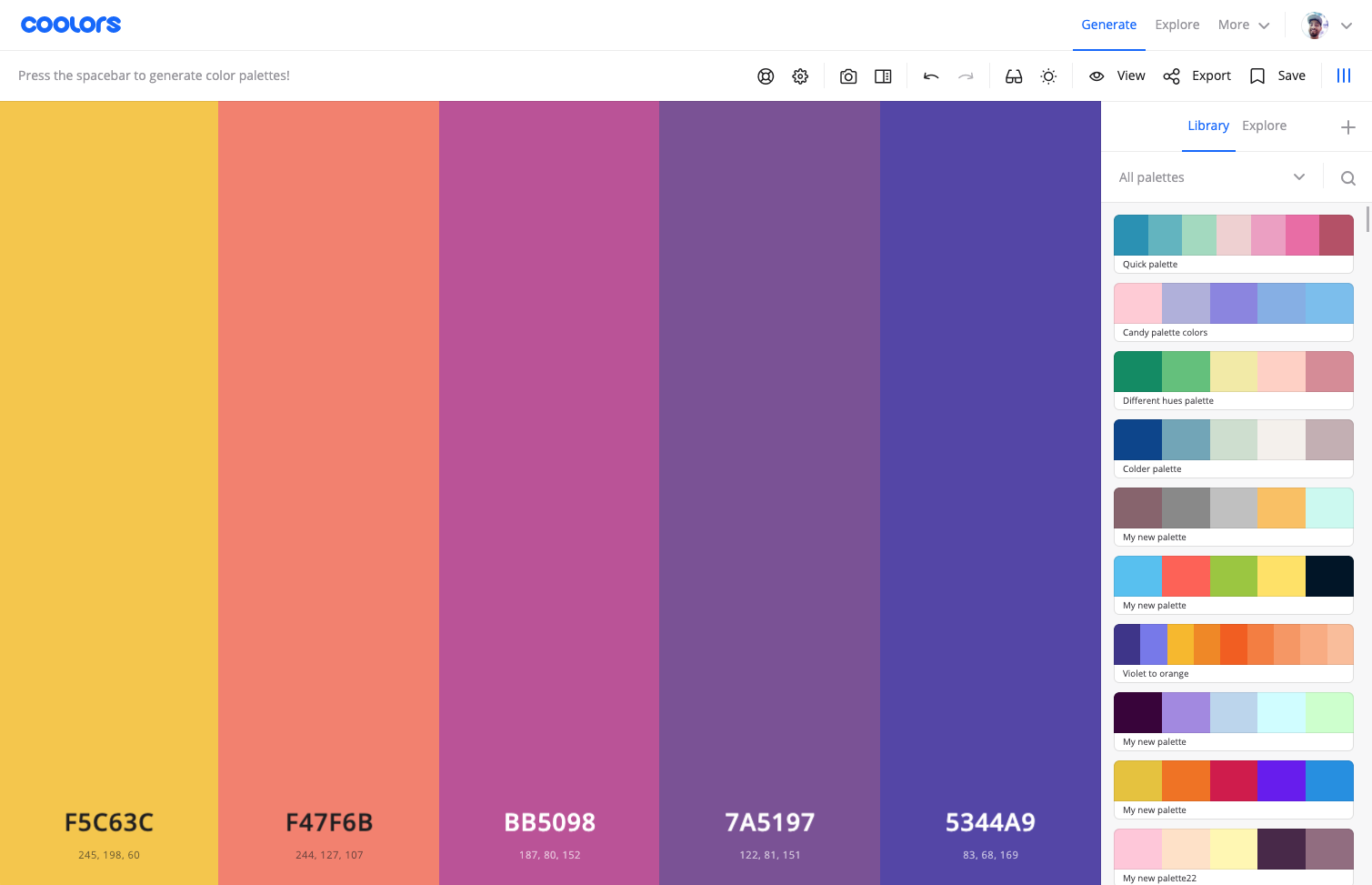
© Coolors, Fair Use
Coolors is an intuitive, fast, and easy-to-use tool for generating color palettes. You can create, save, and share color schemes with a single click. The tool also allows you to explore trending palettes and offer inspiration for your designs.
3. Color Hunt
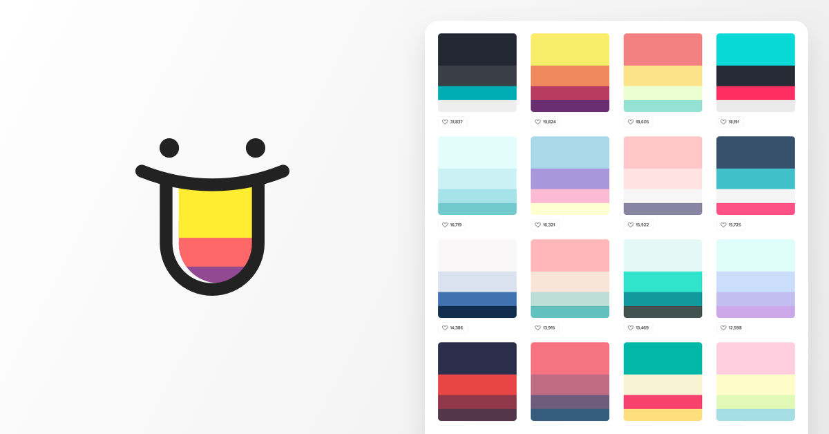
© Color Hunt, Fair Use
Color Hunt is a free platform that offers numerous color palettes created by designers worldwide. It's a great place to gather inspiration and find color combinations other creatives have successfully used.
4. Paletton
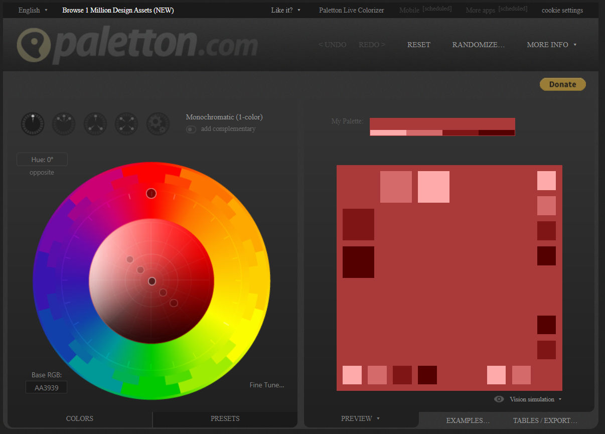
© Paletton, Fair Use
Paletton is a tool that helps create color combinations based on a selected base color. It provides a variety of color harmonies to choose from and gives a preview of how your chosen palette would look in a real-life design.
5. Colormind
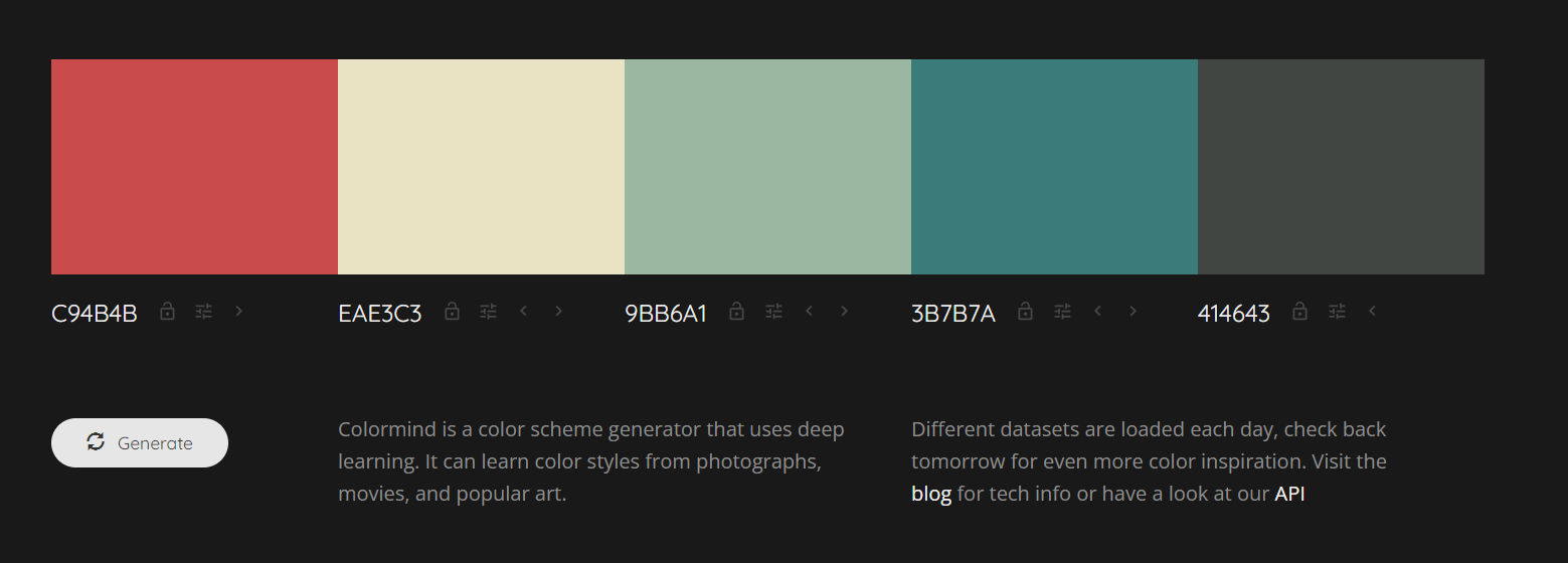
© Colormind, Fair Use
Colormind uses AI to generate color palettes. You can pick your starting color, and the tool will suggest complementary colors. It also allows you to generate color schemes from images or famous movie stills.
6. Contrast Checker
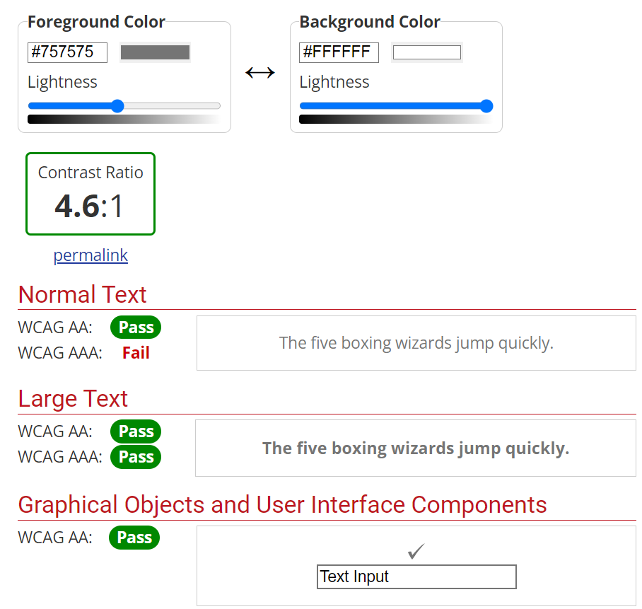
© WebAIM, Fair Use
The Contrast Checker is essential to ensure your color scheme is accessible. It checks the contrast ratio between two colors and lets you know if it passes WCAG (Web Content Accessibility Guidelines) standards.
7. Canva Color Palette Generator
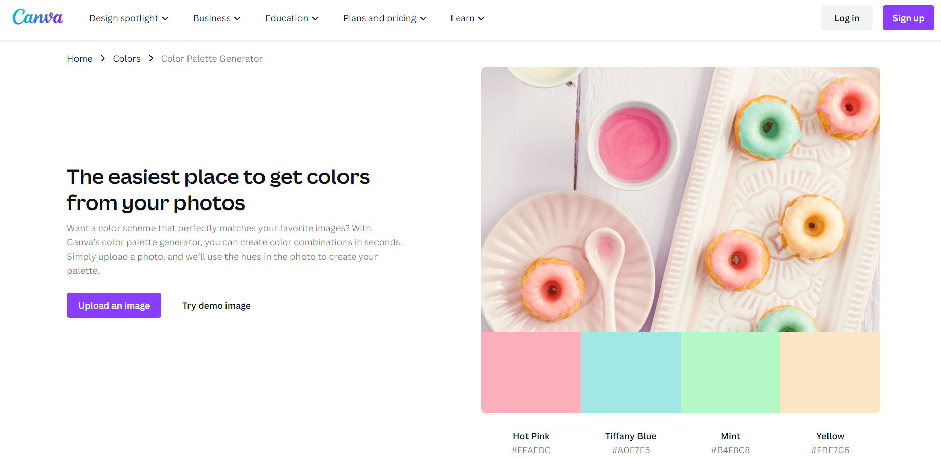
© Canva, Fair Use
Canva’s tool allows you to upload an image and generate a color palette based on it. Creating a color scheme matching a photo or a branding element is especially handy.
These tools for building UI color palettes can dramatically simplify the design process. They balance creativity, precision, and compliance with accessibility standards.
The Take Away
Color isn't merely about aesthetics. It's about usability, accessibility, and effective communication. It can shape user perceptions, guide behavior, and create an engaging user experience.
To build your UI color palette, first understand color theory and recognize the psychological impact of colors. Carefully select colors that align with the brand identity and ensure accessibility. Keep yourself updated with the latest research and trends and learn from successful examples. Use online tools to streamline your design process and generate effective, inclusive, and appealing website color schemes.
The power to create an impactful UI design lies in your hands. Take these insights, apply them, experiment, and let your designs speak volumes. After all, a well-crafted color palette can be the difference between a good design and a great one.
References and Where to Learn More
Dive deeper into color theory with the Visual Design: The Ultimate Guide course.
Take your UI skills to the next level with our curated UI Designer learning path.
Color can also be used deceptively. Find out how to avoid falling into these color traps in Use Color to Prevent Confusion and Help Your Users
Short on time for a full course? Watch this Master Class webinar by Color consultants and authors Arielle and Joann Eckstut, How To Use Color Theory To Enhance Your Designs.
